Discover the true eburnean color meaning, its ivory-inspired beauty, symbolism, emotional impact, and use in art and design.
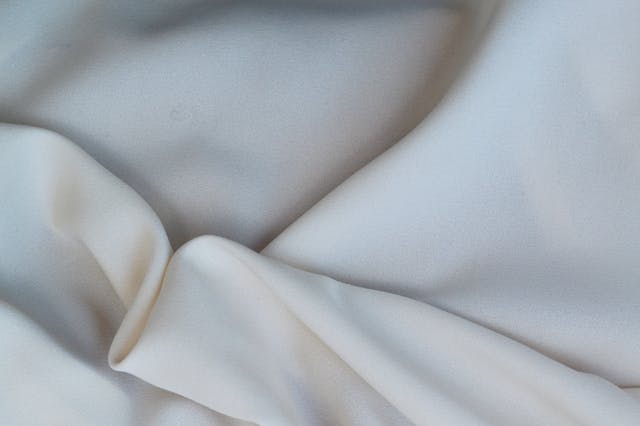
The term eburnean refers to something that resembles ivory in color, texture, or appearance. The eburnean color meaning is often associated with softness, elegance, purity, warmth, and timeless luxury rather than stark white minimalism.
Unlike bright white, eburnean tones feel lived-in, organic, and quietly refined.
I first stumbled across the word eburnean in an old design forum where someone described a room as “bathed in eburnean light.” And honestly, I paused. The word felt heavier than “cream” and softer than “white.” It sounded ancient. Almost ceremonial.
That’s the strange thing about rare color words. They don’t just describe shades. They carry atmosphere.
The eburnean color meaning sits somewhere between ivory, bone, antique paper, moonlight, and polished marble warmed by time. It isn’t loud enough to dominate a room, but it changes how a space feels. Quietly. Persistently.
And maybe that’s why the word keeps resurfacing in art, luxury branding, interior design, and fashion. People are searching for softer aesthetics now. Less sterile perfection. More warmth. More humanity.
Eburnean captures that shift almost perfectly.
What You'll Discover:
What Does Eburnean Mean?
The word eburnean comes from the Latin word ebur, meaning “ivory.”
Traditionally, the term described objects made of ivory or resembling ivory in texture and color. Over time, the meaning expanded beyond material and became strongly connected to color symbolism.
Today, the eburnean color meaning usually refers to:
- Ivory-white tones
- Warm off-whites
- Creamy pale shades
- Smooth luminous textures
- Gentle elegance
It is not pure white.
That distinction matters more than it seems.
Pure white can feel clinical. Eburnean feels human.
The Emotional Meaning Behind Eburnean Color
Colors shape emotion before logic catches up. You walk into a room and feel something long before you analyze why.
Eburnean tones often create emotional responses linked to calmness, intimacy, and understated sophistication.
Softness Without Weakness
Some pale colors disappear into the background. Eburnean does not.
It has presence, but not aggression. Think of handwritten letters aging in a cedar drawer. Or candlelight reflecting on old piano keys.
There’s softness there. But also permanence.
That’s part of the deeper eburnean color meaning: quiet confidence.
Warmth Instead of Sterility
Bright white interiors became massively popular during the minimalist boom. But eventually, many people realized something uncomfortable.
Perfect white spaces can feel emotionally cold.
Eburnean shades solve that problem by introducing warmth without sacrificing brightness.
Interior designers often describe ivory-toned palettes as “approachable luxury.”
That phrase actually fits.
A Color Connected to Memory
Eburnean shades frequently appear in objects associated with history and preservation:
- Ancient manuscripts
- Sculptures
- Classical architecture
- Vintage lace
- Piano keys
- Aged photographs
Because of that, the color naturally triggers nostalgia.
Not dramatic nostalgia. Quiet nostalgia.
The kind that sneaks up on you.
Eburnean vs Ivory vs Cream vs White
Many people assume these shades are interchangeable. They are not.
The emotional effect changes significantly depending on undertones and context.
Comparison Table: Similar Shades
| Shade | Appearance | Emotional Feel | Common Use |
| Eburnean | Ivory-inspired warm white | Elegant and timeless | Luxury design, literature |
| Ivory | Pale yellow-white | Traditional and refined | Weddings, décor |
| Cream | Rich warm off-white | Cozy and soft | Interiors, fashion |
| Pure White | Bright neutral white | Clean but clinical | Minimalist spaces |
| Beige | Brown-toned neutral | Earthy and practical | Modern interiors |
Eburnean usually feels more poetic than cream and less yellow than ivory.
It lives in the middle ground.
And honestly, that’s why people are drawn to it.
Why Rare Color Words Fascinate People
There’s something oddly intimate about discovering a word for a feeling you already recognized but never named.
That’s part of the attraction here.
The eburnean color meaning resonates because modern language around color has become strangely limited. We say “off-white” for dozens of completely different emotional tones.
But language shapes perception.
Once you learn the word eburnean, you start noticing it everywhere:
- Museum sculptures
- Luxury hotel interiors
- Winter photography
- Wedding stationery
- Matte ceramics
- High-end skincare branding
The world suddenly feels more textured.
Eburnean Color in Interior Design
Interior design may be where eburnean tones shine brightest.
Not because they are trendy, but because they solve a practical emotional problem.
People want brightness without emotional emptiness.
Why Designers Use Eburnean Tones
Eburnean shades diffuse light beautifully. They soften harsh edges and create depth without needing dramatic contrast.
According to design professionals, warm ivory palettes often make rooms feel larger while remaining emotionally inviting.
That balance is difficult to achieve.
Common Eburnean Design Pairings
Natural Wood
Oak, walnut, and ash create warmth against eburnean walls.
The combination feels grounded rather than polished to perfection.
Brass Accents
Brass and ivory tones create a subtle old-world elegance.
Not flashy luxury. Inherited luxury.
There’s a difference.
Linen and Textured Fabrics
Eburnean colors work especially well with tactile materials because the shade itself already implies softness.
Flat synthetic surfaces can make the color feel lifeless.
Texture gives it soul.
Eburnean Color Meaning in Fashion
Fashion tends to cycle aggressively between extremes. Loud colors dominate for a while, then neutrals reclaim space.
Eburnean survives both cycles.
That says something.
Why Eburnean Clothing Feels Expensive
Luxury fashion brands frequently rely on ivory-based palettes because they communicate refinement without visual noise.
An eburnean silk dress does not demand attention.
It earns it gradually.
That restraint often reads as wealth, maturity, and confidence.
Bridal Fashion and Eburnean Shades
Many modern wedding dresses are no longer pure white.
Instead, designers use:
- Soft ivory
- Champagne white
- Antique cream
- Eburnean undertones
Pure white can wash out skin tones under natural lighting. Eburnean shades feel softer and more dimensional in photography.
That shift reflects changing beauty standards too.
Less perfection. More warmth.
Symbolism Associated With Eburnean Color
The eburnean color meaning extends beyond aesthetics into symbolism and psychology.
Purity Without Innocence
White traditionally symbolizes purity. But eburnean tones complicate that symbolism.
They suggest wisdom alongside purity.
Experience instead of untouched innocence.
That subtle difference matters in literature and visual storytelling.
Quiet Luxury
Modern luxury branding increasingly avoids excessive gold, black, and shiny surfaces.
Now the trend leans toward muted elegance:
- Ivory packaging
- Matte textures
- Soft monochromatic palettes
Eburnean tones embody “whispered wealth.”
The aesthetic says:
“I don’t need to prove anything.”
Mortality and Preservation
Historically, ivory carried associations with permanence and fragility simultaneously.
That contradiction still lingers in the color symbolism today.
Eburnean shades can feel:
- Eternal
- Delicate
- Sacred
- Fading
- Preserved
Very few colors carry that emotional complexity.
Eburnean in Art and Literature
Some words survive because they are useful.
Others survive because they feel beautiful to say.
Eburnean belongs to the second category.
Why Writers Use the Word
Writers often choose eburnean when plain color descriptions fail emotionally.
Compare these two sentences:
- “She stood beneath white light.”
- “She stood beneath eburnean light.”
The second creates atmosphere immediately.
It feels older. Softer. Cinematic.
Classical Art Connections
Eburnean tones appear constantly in:
- Renaissance sculpture
- Marble architecture
- Religious paintings
- Classical portraiture
Artists used ivory-toned highlights to create realism and warmth in skin, fabric, and stone.
Pure white was rarely the goal.
Real life contains warmth.
Modern Branding and the Rise of Eburnean Aesthetics
Something interesting happened over the past few years.
Digital culture became visually exhausting.
Everything got brighter, louder, sharper, faster.
In response, many brands moved toward softer neutral palettes.
That’s where eburnean aesthetics quietly exploded.
Industries Using Eburnean Color Palettes
Luxury Skincare
Soft ivory packaging suggests calmness, trust, and gentleness.
It visually communicates:
“This product won’t overwhelm you.”
Boutique Hotels
Eburnean interiors create emotional comfort while maintaining sophistication.
Travelers increasingly want spaces that feel restorative rather than performative.
Wellness Brands
Meditation apps, candle companies, and wellness studios frequently use warm ivory palettes because they reduce visual tension.
The psychology is subtle but effective.
The Contradiction at the Center of Eburnean Color
This part fascinated me most while researching.
Eburnean is both timeless and deeply modern.
That shouldn’t work. But somehow it does.
It references:
- Ancient ivory carvings
- Classical sculpture
- Historical manuscripts
Yet it also fits perfectly inside contemporary minimalist design.
That contradiction gives the color unusual flexibility.
It can feel:
- Traditional
- Modern
- Luxurious
- Humble
- Sacred
- Casual
Very few color concepts can move across that many emotional spaces naturally.
Quotable Insights About Eburnean Color Meaning
“Eburnean tones create warmth without sacrificing elegance.”
“Unlike pure white, eburnean shades carry emotional texture.”
“The eburnean color meaning blends softness, memory, and quiet luxury.”
How to Use Eburnean Color Effectively
People often misuse soft neutral colors by removing all contrast.
That creates flatness.
Eburnean works best when balanced carefully.
Best Pairings
- Charcoal gray
- Warm walnut wood
- Muted olive
- Matte black
- Dusty rose
- Bronze
Avoid Overusing It
Too much eburnean without texture can feel faded rather than elegant.
Layering matters:
- Linen
- Wool
- Stone
- Ceramic
- Natural grain wood
The color thrives on imperfection.
Is Eburnean Still Relevant Today?
Absolutely. Maybe more than ever.
Modern aesthetics are moving away from hyper-polished perfection and toward emotional realism.
People want:
- Warmth
- Texture
- Calmness
- Authenticity
Eburnean naturally supports all four.
It feels restorative in a visually aggressive world.
And perhaps that explains why the word itself feels strangely comforting when you say it aloud.
FAQ About Eburnean Color Meaning
What does eburnean color mean?
Eburnean refers to an ivory-like color or texture. It usually describes warm, soft white tones associated with elegance and refinement.
Is eburnean the same as ivory?
Not exactly. Ivory is a specific pale yellow-white shade, while eburnean is broader and often includes emotional or artistic associations with ivory.
Where does the word eburnean come from?
The term comes from the Latin word ebur, meaning ivory.
Is eburnean a real color?
Yes. While uncommon in everyday speech, eburnean is recognized as a descriptive term for ivory-inspired coloration and appearance.
Why do designers use eburnean tones?
Designers use eburnean shades because they create warmth, softness, and sophistication without the harshness of pure white.
Key Takings
- The eburnean color meaning centers on ivory-inspired warmth, softness, and timeless elegance.
- Eburnean differs from pure white because it feels emotionally warmer and more organic.
- The color is strongly connected to luxury, memory, calmness, and understated beauty.
- Interior designers use eburnean tones to create inviting yet sophisticated spaces.
- Fashion brands rely on eburnean palettes to communicate quiet confidence and refinement.
- The word itself carries artistic and literary depth beyond simple color description.
- Eburnean aesthetics remain highly relevant in modern wellness, design, and luxury branding.
Additional Resources:
- Pantone Color Psychology Guide: Learn how soft neutral tones influence mood, branding, perception, and emotional response in visual design.


